This blog post is part of the Ecobytes series, where we explore interesting topics using Ecological Footprint and biocapacity data. This week, Leo Wambersie dives into data on transportation. Leo is a Research Associate at Global Footprint Network. With a background in engineering and urban planning, he believes strongly that cities hold the key to a fair and sustainable future. He holds an MS in City and Regional Planning from UC Berkeley and a BS in Environmental Systems Engineering from Stanford.
Personal mobility is responsible for about 15% of humanity’s total Ecological Footprint, so any comprehensive one-planet strategy likely addresses transportation. City planning is one of the main tools we have available to shift transportation patterns, and it is especially critical because both good and bad planning decisions are literally etched in stone (or concrete and asphalt): the first highways constructed in Europe and the United States are now almost a century old. In some areas, street-layouts have remained unchanged for over a thousand years, essentially locking in the density and walkability of these neighborhoods.
Fortunately, we have the data to look at this more closely. One of the major analytical tools we have here at Global Footprint Network is the Consumption Land-Use Matrix (CLUM). Because it connects household consumption activities to their Ecological Footprints, we can estimate things like the Ecological Footprint associated with the consumption of meat in the Netherlands, the purchase of household appliances in Japan, or tailpipe emissions from personal transportation vehicles worldwide. This blog post will make use of the CLUM to take a deeper look at the Footprint of all transportation activities, how this ‘total transportation Footprint’ differs between countries, and what it might tell us about how we should move forward as we work to end global overshoot.
Which country’s transportation Footprint provides the best example to follow?
Although this is an obvious question to ask, it remains a tricky one: Answering it doesn’t simply mean finding the country with the lowest transportation Footprint per capita, because in general a country’s Footprint naturally increases along with social and economic development. Whereas some lower-income countries may hold plenty of lessons regarding efficient and effective transportation systems, it is nevertheless expected that their Footprints increase as average incomes go up. Clearly the solution to global overshoot cannot be to reduce a country’s wealth or level of development. Instead, answering the question above involves identifying which country (or city, or region) has been the most successful at minimizing its transportation Footprints despite achieving high levels of human development. We can use the Human Development Index to quantify and compare different levels of development.
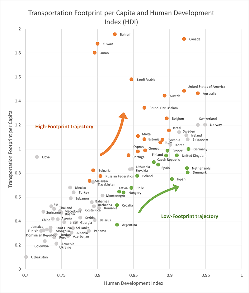
The relationship between a country’s average per-capita transportation Footprint and its human development index is presented in figure 1, which also highlights how countries can fall along two possible development pathways. Countries that fall on the first pathway, depicted in orange and including Canada, Austria, and Saudi Arabia, have high transportation Footprints relative to their HDI. Countries that fall on the second pathway, depicted in green and including the Netherlands, Denmark, and Japan, have relatively low transportation Footprints compared to HDI. This second pathway represents “current best practice” countries, which their peers should be attempting to emulate and draw inspiration from. However, it must be noted that both trajectories are still moving upwards, whereas ending overshoot will require the curve to be bent down and to the right.
What can we learn from this type of comparison?
Comparing countries is always a difficult exercise, as there is such a diversity of geographic and historic contexts to consider. Given the diversity of countries which make up the high and low development pathways, it is tempting to write off the differences in transportation Footprints as unavoidable. Perhaps the countries in the low-Footprint group are smaller, denser, or their cities may be older? After all, the cities in this group are mostly small and European, whereas the high-Footprint group includes gulf petrostates (Kuwait, Bahrain) and expansive ex-colonies (Canada, Australia). But can we determine specifically why the first group has fared so much better?
Is density to blame for the difference?
Looking at the countries which exhibit high transportation Footprints, many stand out as low density: The United States, Canada, Australia, the Russian Federation, Saudi Arabia – countries which are large and sparsely populated. However, having a low density at the national level should not tell us too much about their aggregate transportation patterns, as their populations may still be concentrated in a few major cities. A comparison of urbanization rates – the percent of the population living in cities –reveals that there are no significant differences between the high-Footprint trajectory countries (80% urbanized) and the low-Footprint countries (79.5% urbanized).
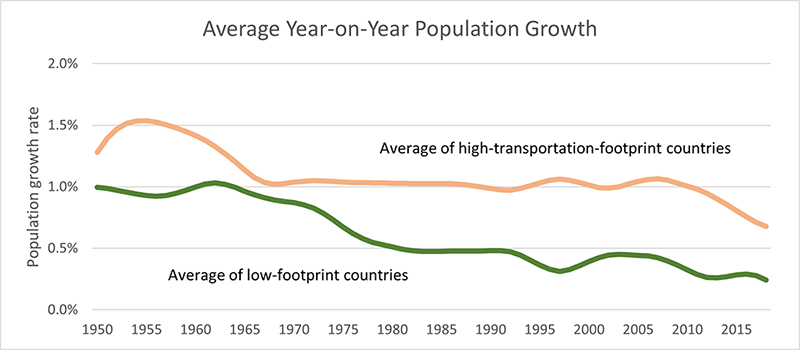
If there is no difference in urbanization rates, perhaps the difference lies in the density of the cities themselves. Although there is no easily accessible source of data on urban densities, an alternative could involve looking at when populations have grown: The history of urban development patterns suggests that more recent, post-1950 urban development is low-density and car-centric, whereas pre-1950s cities are denser and more accommodating to public transport than the automobile. If population growth is correlated with urban development and we ignore any potential time lags, we can assume that countries which experienced more significant population growth post-1950 can therefore be expected to be more car-oriented, and therefore exhibit higher transportation Footprints.
Plotting a weighted average of the population growth rate for high and low-transportation-Footprint countries shows that the high-Footprint countries have tended to grow twice as fast in recent decades. This is not conclusive evidence however, and there are many exceptions to this pattern which highlight the importance of regional trends: Chile and Argentina (low transportation Footprint countries) have grown at similar rates to their North American counterparts, as have high-Footprint European countries relative to their low-Footprint European peers. Nevertheless, this result suggests a hypothesis that a country’s transportation Footprint is related to the age of its towns and cities.
If transportation Footprint is related to the period in which a country’s population grows and its cities mature, what can be done about it?
After all, we cannot simply make North American cities older, for example. The answer lies in the fact that there is no intrinsic reason why young cities must be more wasteful than the old. The Netherlands is the European country that has grown the fastest since 1950 (from 10 million to over 17 million people), yet despite this fact it has managed to use its history of dense, walkable districts to influence the design of new neighborhoods. Instead of building the sprawling, highway-oriented neighborhoods found in countries such as the United States, Canada, and Australia, many new developments in the Netherlands are oriented towards density, bicycling, and public transit. This is only possible because of the consensus which exists between planners, politicians, and citizens, and its success is represented in the country’s low transportation Footprint. Each country comes with its own specific context and challenges, and by no means is switching to Dutch-style neighborhood development a silver bullet – the per-capita Dutch Footprint is still far too high if we are to achieve a one planet Footprint. However, it represents one potential model that can put us on the road to living within our means.
What do you think about the importance of urban transportation planning? Send us an email at data@footprintnetwork.org with your response.


